http://rasso.co.kr/89

사진을 촬영한 후 인물과 같은 주 피사체를 배경으로부터 분리해야 할 경우가 많이 있습니다. 상업사진의 경우는 주 피사체와 배경을 별도로 촬영하여 합성해야 할 필요가 더욱 많습니다. 디지털 아트 작업을 할때에도 필수적으로 활용되는 방법입니다.


인물을 배경으로부터 분리할 때 흔히 누끼딴다라는 표현을 많이 하는데 이것은 Pen 툴로 일일이 외곽을 따라 그린 후 선택영역으로 변환하여 분리하는 방법입니다. 가장 간단한 방법으로는 Earase 툴로 바로 지우거나, 레이어 마스크를 활용하여 배경을 지우는 방법이 있습니다. 그리고 조금 더 고급 과정에서는 채널 정보를 활용하여 채널 마스크를 만들고 알파 채널로 만들어 저장 후 레이어 마스크로 적용하기도 합니다.


이번에 알아볼 기능은 배경에서 인물을 분리하는 방법 중 제가 아는 범위에서 가장 쉬운 방법인 것 같아서 소개해 드립니다. 사용하게 될 툴은 Magic Eraser (단축키 E) 입니다. 저는 그동안 한번도 써 보지 않았는데 냐옹이주인님의 아래 글을 통해서 이 툴의 기능을 알게 되고 활용해 보니 정말 편한 기능이라 다시 한번 기능 활용 방법을 정리해 보았습니다.


>> 냐옹이주인님 강좌 링크


배경 분리를 위한 사진을 준비한다


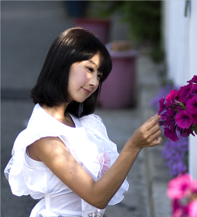
기본적으로 피사체와 배경을 분리하기에 좋은 사진이 어떤 것인지 알 필요가 있습니다. 아래 샘플 사진과 같이 인물의 의상과 배경의 색상이 차이가 날수록 좋습니다. 영화를 찍을 때 합성할 장면은 블루 스크린 앞에서 인물 촬영 후 배경과 합친다는 것을 알고 계실 겁니다. 인물이나 주 피사체를 배경과 분리할 경우에는 주 피사체의 색상과 대비되는 색상으로 배경처리를 하는 것이 아주 중요합니다.


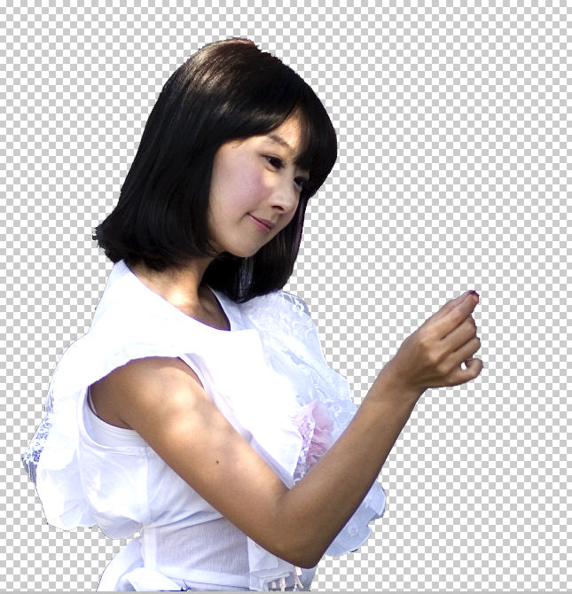
아래 사진은 일반 스냅 사진으로 흰옷과 머리결을 배경과 분리하는데 그다지 어렵지 않은 경우입니다. 이런 경우에 가장 효과적인 툴이 바로 Magic Eraser 툴입니다.

배경 분리를 위한 준비작업


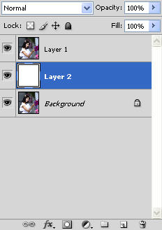
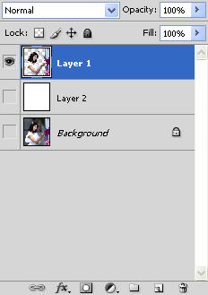
.
원본을 보존하기 위해 레이어를 하나 더 복사합니다 단축키 [Ctrl + J]

. 새로운 레이어를 하나 더 추가합니다. 아래 휴지통 아이콘 왼쪽의 New Layer 아이콘을 클릭하면 됩니다.

. 새로 만들어진 레이어를 원본 사진을 복사한 레이어 아래로 옮깁니다. 아래 그림을 보면 Layer 2 Layer 1 아래에 있는 것을 확인하실 수 있습니다.

. 단축키 D를 눌러 전경색을 흰색으로 바꿉니다.

. 단축키 Alt + Delete 를 눌러 Layer 2 를 전경색으로 채웁니다.


Layer 2 를 만드는 것은 Layer 1 에서 배경을 지울 때 어떤 부분이 지워졌는지 확인하게 위해서입니다. 꼭 흰색이 아니라 구별을 위해 어떤 색으로 채우셔도 상관없습니다.


Magic Eraser
툴 이해하기

단축키 E 를 누르면 지우개 툴의 종류가 바뀌게 되는데 위에 보이는 아이콘이 바로 Magice Eraser 툴입니다.


Magic Eraser 툴을 선택하면 위와 같은 옵션바가 나타납니다. Tolerance 값을 크게 해서 비슷한 색상의 픽셀들을 한꺼번에 지우고, 값을 작게 해서 정밀하게 픽셀들을 지울 수 있습니다. 클릭한 곳의 픽셀 색상값에 대한 관용도라고 이해하시면 되고 몇번 해 보시면 금방 이해하실 수 있습니다.

Anti-alias 를 체크해 주시고, contiguous 는 연결된 픽셀에 대해서 적용하기 위한 것인데 대부분의 경우 체크해서 사용하는 것이 좋습니다. Sample All Layers 도 체크해서 여러 개의 레이어가 있더라도 전체 레이어에 적용이 되도록 하시고 Opacity 100%로 작업하시면 됩니다.


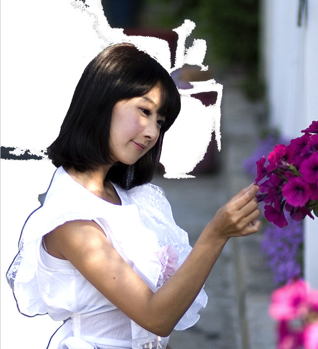
Magic Eraser
작업 과정 1단계

Magic Eraser 툴로 인물 주변의 배경을 그저 클릭만 하시면 위와 같이 바뀌게 됩니다. 흰색으로 보이는 부분은 위에서 봤던 아래 레이어의 흰색이 보이는 것이 실제 해당 레이어에서는 색상이 지워진 것입니다.


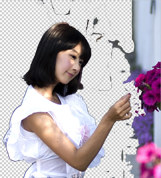
Magic Eraser
작업 과정 2단계

아래 레이어를 모두 끈 상태에서 살펴보면 배경이 점차 투명으로 지워지고 있는 것을 확인하실 수 있습니다. 손과 손아래 옷 부분에서는 Tolerance 값을 12 정도로 줄여서 클릭하시면 됩니다. 너무 많이 지워지면 단축키 Ctrl + Z 하시고 사진을 단축키 +로 확대하신 후 Tolerance 값을 더 줄여서 클릭하시면 됩니다. 현재 상태의 레이어 상황을 살펴보면 아래와 같습니다.


Magic Eraser 작업 과정 3단계

외곽선을 따라 세밀한 작업이 끝났다면 그 외 나머지 영역은 일반 Eraser 툴을 이용하여 슥슥 지우시면 됩니다. 그 결과는 아래와 같습니다. 완전하게 깨끗이 지워졌습니다. 여기까지 Magic Eraser 툴과 Eraser 툴로 몇분 걸리지 않는 작업입니다. 정말 초간단 작업입니다.


Magic Eraser 작업 과정 최종 단계

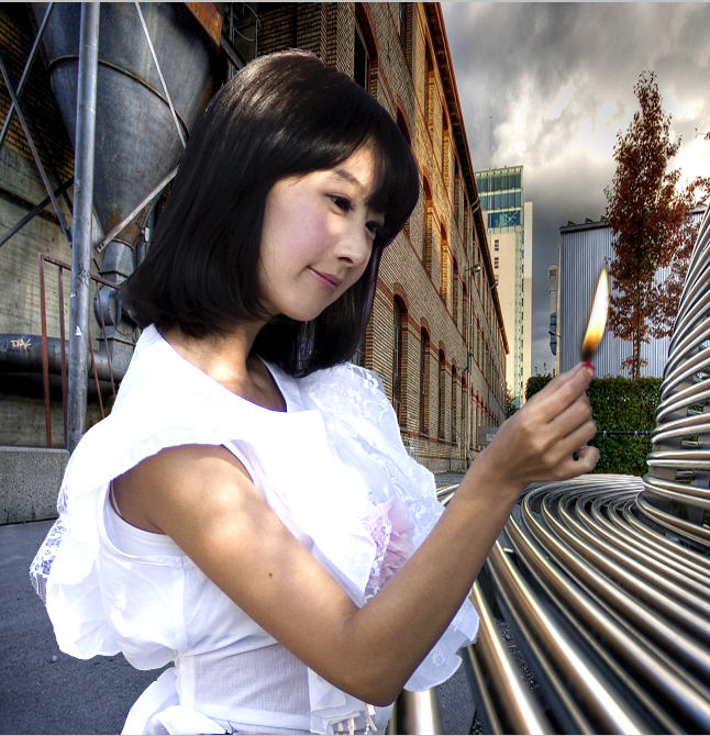
배경이 완전히 지워진 이미지에 적당한 배경과 합성을 한다면 얼마든지 내가 원하는 분위기의 사진으로 바꿀 수 있습니다. 아래는 낯선 거리에서 손가락에 불을 피워올리는 마술을 하고 있는 현선씨의 모습입니다. 신속한 강좌 작성의 목적상 조금 자연스럽지 못한 배경입니다만 시간을 가지고 원근 비율과 분위기에 맞는 배경을 찾으신다면 깜쪽 같은 합성을 하실 수 있을 겁니다.


마치며

포토샵에서 제법 많은 기능들을 활용하고 있다고 생각했는데 Magic Eraser 툴을 이번에 써 보면서 제가 잘 활용하지 않고 있는 기본 툴의 기능들을 조금 더 살펴봐야겠다는 생각이 들었습니다. 여러분들에게도 Magice Eraser 툴이 좀 더 자주 사용되는 툴이 되길 바랍니다. ^^


by Anna 안나 2009. 2. 27. 22:30
각종 포토샵 설정 팁1. 포토샵에서 갑자기 폰트들이 안 보일 때

컴퓨터를 안전모드에서 부팅해서
시작 >> 검색 >> 파일 또는 폴더
ttfcache 라고 입력한 다음 나오는 파일을 삭제해주시면 됩니다.

2. 포토샵 처리속도 빠르게하기

+ 영문버젼 Edit> Preferences> Memory & Image Cache > Used by Photoshop
+ 한글버젼 편집 > 환경설정 > 메모리와 이미지 캐쉬 > 메모리사용
기본적으로 50% 로 되어있는 부분을 80% 정도로 높여주면 처리속도가 빨라진답니다.

3. 다운받은 "브러쉬", "스타일" 삽입하는 방법

+ 브러쉬[Program Files]-[Adobe]-[Photoshop]-[Presets]-[Brushes] 폴더안에 넣으세요.
+ 스타일 [Program Files]-[Adobe]-[Photoshop]-[Presets]-[Style] 폴더안에 넣으세요.

4. 한글 포토샵→영문으로

한글 포토샵을 영문버전으로 바꾸시려면 [Program Files] - [Adobe Photoshop6.0]-[Required]에서 tw10428.dat를 지워주시면 됩니다.

5. 포토샵에서 한글 폰트 한글로 나오게 하기

+ 포토샵 5.5 : 파일 (File)-환경설정(preferences)-일반(general)-show font names in english 체크 해제
+ 포토샵 6.0 : 편집 (Edit)- 환경설정(preferences)-일반(general)-show font names in english 체크 해제

6. 포토샵 필터 사용법

필터를 다운받은 담에 압축을 풀때 꼭 photoshop-->plug-ins 폴더안에 압축을 풀어주세요.
다른 디렉토리에 이미 압축을 풀었다면 꼭 plug-ins 폴더안으로 옮겨주세요.
포토샵을 종료한후 다시 실행하면 메뉴의 필터라는 메뉴안에 새로운 필터가 들어있는걸 보게 됩니다.

7. 웹폰트 포토샵에서 최적싸이즈..

웹폰트 뒤에 나오는 숫자를 보면 9,10,12 이러케 3종류입니다.
(예;웝정9,웹정10,웹정12,민9,네딱12,둥딱12)

숫자가 9인폰트들 - 글씨크기 12싸이즈로 작업합니다.
숫자가 10인폰트들 - 글씨크기 13싸이즈로 작업합니다.
숫자가 12인폰트들 - 글씨크기 16싸이즈로 작업합니다.

숫자가 없는 폰트일경우 포토샵에서의 기본싸이즈는
거의가 글씨크기12싸이즈입니다.
by Anna 안나 2009. 1. 5. 01:39
점점 게을러져 강좌 만들기를 소홀히 하고 있습니다. 오늘은 직접 만들어서 올리지 못하고, 갖고 있는 강좌를 하나 올리겠습니다. 작년 여름, 사진 관련 커뮤니티에 강좌를 올릴 일이 생겨, [기억 그리고 추억] 블로그(http://blog.naver.com/bigway22) 운영자에게 부탁한 강좌입니다. 설명에도 나온 것처럼, 비네팅 효과와 함께 색상을 좀더 선명하게 하는 방법을 배울 수 있습니다. 포토샵 입문자는 조금 어렵게 느껴질 수 있습니다. 그냥 이런 것도 있구나 하면서 보는 것도 좋을 듯 합니다.


by Anna 안나 2008. 12. 21. 23:35
provenance 참조
by Anna 안나 2008. 12. 21. 23:22
오늘 알려드릴 강좌는 여러 장의 이미지 정렬하는 방법에 대해서 입니다. 다른 사람들에게 보여주고 싶은 이미지는 여러 장인데 일반적으로 보면 한 번에 업로드 가능한 이미지는 두 장 정도입니다. 개인서버가 있다면 HTML 소스를 이용하여
이미지를 링크를 걸어두면 다 보여줄 수 있겠지만, 그렇지 않은 분들이 많을 것입니다. 이런 분들은 방법이 있습니다. 포토샵에서 한 바탕에 여러 이미지를 보기 좋게 정렬해서 하나의 이미지로 만들면 됩니다. 그런데 마우스로 여러 장의 이미지를 일정 간격을 두고 나란히 정렬한다는게 쉽지 않은데요. 오늘 강좌를 보시면 클릭 몇 번에 깨끗이 정렬할 수 있습니다. 간단한 방법이지만 알고 있으면 좋은 팁입니다.
따라해 보세요. s( ̄へ ̄)z 후훗~ (프로그램 : 포토샵 7.0)

새창을 하나 열고 새로운 레이어를 추가하시고 정렬한 이미지를 열어서 붙여주세요. 저는 예제로 도형을 쓰겠습니다. 도형들이 균일하지 않게 나열 되어 있습니다. 위 도형들의 레이어의 상태입니다. 어떻게 도형들을 간단하게 정렬할까요?

객체정렬 기능을 이용하면 손쉽게 객체간 수평, 수직, 정렬을 할 수가 있습니다. 정렬하고 싶은 객체가 있는 레이어끼리 연결시켜 줍니다. 정렬 되는 것을 확인해 보기 위해 먼저 빨강네모와 주황네모, 노랑네모를 연결시켜 보겠습니다. 연결 한후 도구상자에서 Movo Tool을 선택합니다. Movo Tool을 선택하면 옵션 툴바에 왼쪽과 같은 도구 모음이 보일 것입니다. 옵션 툴바에 나타나는 도구 모음에서 "distribute vertical centers" 버튼을 선택해 봅니다. 정렬 기준으로 노랑네모가 있는 레이어를 선택했습니다.

※ 정렬 버튼을 선택하기 전에 기준으로 정할 이미지가 있는
레이어를 선택하셔야합니다. 이 버튼을 선택하면 흩어져 있던 객체가 왼쪽과 같이 각 객체간 수직 간격이 균일하게 배치됩니다.

즉! A, B 의 간격이 균일해지는 것입니다. 확인이 되지요? 이번엔 "Align horizontal centers" 버튼을 선택해 보겠습니다.
4가지 도형을 다 연결보겠습니다. 선택을 하고 보니 단어 뜻 그대로 객체간 수직선을 기준으로 정렬이 되었습니다. 물론 각 객체가 연결되어 있으므로 이 상태에서 원하는 위치로 한 번에 이동하여 배치 할 수도 있겠지요?

마우스로 아무 레이어나 선택한 후 클릭한 상태에서 왔다 갔다 해보세요. 같이 움직이지요? 다른 객체 정렬 버튼도 선택해보시고 차이점을 살펴보세요. 앞으로 이미지 정렬은 간단히 할 수 있겠죠?
by Anna 안나 2008. 11. 30. 21:08
1. 캔버스 사이즈를 늘릴때 shift와 ↑또는 ↓키를 누르면 10px씩 늘어나거나 줄어들어요.

2. 화면이 100%이상이나 이하일때 zoom tool(확대시키는 아이콘) 더블클릭하면 100%로 돌아옵니다.

3. move tool을 선택안하고 있어도 ctrl키를 누르면 이동을 할수 있어요
(pen tool일때는 direct selection tool이 되요;)
(hand tool일때는 zoom tool이 되는군요..)

4. 가끔 화면에 그리드선같은게 뜰때는 ctrl+H키를 누르면 없어져요

5. 배경색과 전경색은 x를 누르면 뒤바뀌구요

6. d를 누르면 배경, 전경색이 검은색 흰색이 됩니다.

7. (text tool을 안쓰고 있을때) 숫자를 누르면
brush tool, clone stamp tool, history brush tool, eraser tool, paint tool, blur tool, dodge tool일때는 -> 칠할때의 opacity값이 변경되고
그 밖에 툴은 -> 선택된 레이어의 opacity값이 변경되요
(※'0'을 누르면 100%가 되요)

8. ctrl+F를 누르면 마지막에 했던 filter가 한번 더 적용되요.

9. ctrl+shift+T를 누르면 마지막에 했던 transform이 한번더 적용되요

10. ctrl+T를 누르면 free transform이 뜨구요 그때 오른쪽 마우스를 누르면 transform의 종류도 골를수 있어요
6번에서 추가하자면 x를 누르면 배경, 전경색이 바뀝니다~ (왔다갔다~)
8번에 추가하면 ctrl + Alt + F 하면 마지막에 쓴 필터의 속성창이 나타납니다.
10번에선 ctrl을 누른채 마우스로 transform 포인트로 보이는곳을 찍어서 움직이면 맘대로(약간의 제약은 있지만) 바꿀수있어요. 브러쉬 자주 쓰시는 분은 이거 쓰시면 편하실 꺼예요

[ 키는 브러쉬 크기를 한단계 작게,
] 키는 한단계 크게 하는 단축키 랍니다. 아 생각해보니 [,]는 6.0에서는 다음,이전브러쉬로 넘기는거고
7.0에서는 사이즈 키우고 줄이는거였네요( '') http://www.zeroboard.com/1490448
by Anna 안나 2008. 10. 17. 22:24
Textured graphics are obviously very popular right now, and fortunately there are tons of free Photoshop brushes that will help you to quickly and easily get the textured look you want. This post is a showcase of some of the best sets of brushes available anywhere for creating textures. Dirt Spray (8 brushes) Rust Brushes (13 brushes) Dust & Scratches (12 brushes) Texture Brushes (52 brushes) Scratch Splat Grunge Brushes (15 brushes) Dumpster Brushes (8 brushes) Grunge Brushes 007 (7 brushes) Digea Rust Brushes (9 brushes) TurkHitBox Grunge Set (10 brushes) Cracks (12 brushes) Grunge Notion Brushes (24 brushes)

High Res Dirt Brush Set (8 brushes) Stone and Rust (22 brushes) Cracked Brush Set (19 brushes) Keep Dreaming Volume 44 (12 brushes) Abstract 17 (10 brushes) Grunge Brushes (50 brushes)

Peeling Paint (20 brushes) Scratch Texture (17 brushes) Grunge Brushes 7 (30 brushes) Grunge Brushes 8 (60 brushes) Grunge Brushes 9 (60 brushes) Grunge Brushes 10 (46 brushes) Grunge Brushes by KeReN (40 brushes) Paper Brushes (4 brushes) Rough Edges (19 brushes) Dirt Brushes (5 brushes) Textured Cracks (20 brushes) Texture Brushes (21 brushes) Paper Textures (25 brushes) In Obscuro Texture Brushes (9 brushes) In Obscuro Old Paper Brushes (12 brushes) If you’re interested in working with textures, please see 40 Excellent Photoshop Tutorials for Textures and Backgrounds at Vandelay Design. Originally Published September 22nd, 2008

http://designm.ag/resources/photoshop-texture-brushes/
by Anna 안나 2008. 10. 17. 19:22
웹에서의 디자인 트랜드는 시시각각 빠르게 변화한다. 1990년대 중 후반을 풍미했던 다양한 디자인 트랜드들의 튜터리얼 사이트를 뽑자면 pslover.com과 tutorialwiz.com이 있다. 이들은 이제는 상당히 방대한 양의 튜터리얼 데이터베이스를 갖추긴 했지만 한번 흘러간 트랜드는 사실 거의 쓰레기와 마찬가지 취급을 받게 된다.

필자도 rgbmix.com이나 8tunes.net을 통해 그동안 다양한 튜터리얼을들을 소개하고 직접 만들어 제공하기도 했지만, 계속해서 변화해 가는 디자인 트랜드속에서 옛날 자료들이 점점 ?어 문드러져 가는 느낌을 받을때는 그것이 참으로 허망하다고 느꼈다.

최근 등장한 PSDTUTS나 Photoshoplady 같은 사이트들은 웹 표준으로 무장한 인터페이스에 Clean & Beauty 스타일의 최신 튜터리얼들로 무장하고 나서 튜터리얼 사이트에서의 세대변화를 몸소 느끼게 해주기도 한다. PSDTUTS는 그동안의 튜터리얼 보다는 조금 더 아티스트적인 실력을 요구하는 고난이도 테크닉들을 많이 접하게 해준다. writen by.. http://www.webtrendawards.com/1453
by Anna 안나 2008. 10. 17. 18:32
Last week I posted a collection of Photoshop brushes for creating your own textured graphics. In addition to using brushes, you can get great results and save considerable amounts of time by taking advantage of textures that are freely available. One excellent resources of textures (and other types of stock images) is Stock.xchng. Below you’ll find more than 60 textures from their site. Each image links to the page on sxc.hu where the image can be downloaded. Wood Textures Grass Textures Sand Textures Paper Textures Canvas Textures Leather Textures Metal Textures Satin/Silk Textures
Wall Textures Other Textures

For more texture resources, see 500+ Photoshop Brushes for Creating Textures. Originally Published September 28th, 2008
by Anna 안나 2008. 10. 17. 18:28
Province : http://designm.ag/resources/60-free-textures-from-sxchu/

You can get great results and save considerable amounts of time by taking advantage of textures that are freely available. One excellent resources of textures (and other types of stock images) is Stock.xchng. Designm.ag has shared us “60+ Free Textures from SXC.hu“, you’ll find more than 60 textures from Stock.xchng. Each image links to the page on sxc.hu where the image can be downloaded.
by Anna 안나 2008. 10. 17. 18:28


'디자인_포토샵 > p_pattern' 카테고리의 다른 글

Jansport  (0) 2008.03.08
starry patterns  (0) 2008.03.08
textured stripes  (0) 2008.03.08
Thai patterns  (0) 2008.03.08
12Months  (0) 2008.03.08
bright patterns  (0) 2008.03.08
colorful  (0) 2008.03.08
by Anna 안나 2008. 10. 17. 17:42
외국 무료 웹디자인 리소스 ( 패턴, 배경, 텍스쳐) 출처 : http://www.thewebsqueeze.com/articles/web-design-resource-for-free-patterns-backgrounds-and-textures.html

3Quarks
A rather small selection of backgrounds that include categories such as paper, canvas, wallpaper, cardboard and Japanese papers. Very soft colors. Absolute Background Textures Archive
Archive is a great term since it houses 5740 different textures. Don’t let that amount of textures overwhelm you. You can search by either color or by pattern. And if you want to preview a background, select it and watch the page background change. All Free Backgrounds
Nice selection. Search by color or pattern and preview the background for more detail. Amazing Textures
88 free photo textures. Amurai Shizoo
This site has spectacular backgrounds. The only downside is you can’t get a good view of them without downloading. But I think you’ll find it worth the effort. Auto FX Software
Excellent selection of seamless textures and backgrounds. You will need to sign up for an account but membership is free. Background City
Search this site for backgrounds by either groups or themes. Bravenet CG Textures
Photo textures with many unique categories. The selection is large and impressive and easy to look through since the site has a nice menu tree that is well labeled. Citrus Moon Patterns
This site has a fairly large selection. The nice thing is that you can search by color which often helps in reducing the browsing time. COLOURlovers
One of the more recent additions to this site is their category of patterns. The variety is growing daily so this is a site that you must check out. Createsk8
If you are a user of Illustrator you must see these patterns and textures. These contemporary textures will give your designs the current backdrops we are looking for. There are a few packs that are available for PhotoShop users as well. Be sure to checkout the “textures” category as well. Creative Website Design
Some nice selections here.

Dinpattern
This was a recent find that I have to check each and every time I start a new project. The selection is growing everyday and the quality is fantastic. Dr. Web
Free photo textures that Dr. Web calls “dirty”. Graffiti, sand, stone and more! Everyday Icons What a fun selection of backgrounds. Click on one of the tiny tiles. Each tile comes in many colors. If you want to add some real interest to your website, see these backgrounds.
Gallerie1
A non-English site but you don’t need to know the language to search the textures.

Go Media’s Arsenal
Free watercolor packs and texture packs that are amazing! Grunge Textures
Ok, want something peeling, rusting, twisted, ruined and just plain amazing? Check out this selection of high resolution photos. This site screams bookmark me! K10K Pixel Patterns
974 patterns on file at the present time. So many great ones to choose from. You’ll want to check the usage details however. Not all are allowed for commercial use. I love this site! Kollermedia.at
Currently this site has 270+ backgrounds to select from. I think this site has a nice “current” selection of quality backgrounds. This is a site I’d highly recommend. Limelite
Photo textures to use to create different looks. Very unusual selection that you should find interesting. Milleseicentopercento
Small selection however they are very much in style for today’s web design trends. Must see. Power Directory
Over 8000 backgrounds. Many of the categories are outdated, however the realistic categories such as stone, wood, and nature had some useful backgrounds. RepeatXY
Download gorgeous backgrounds or edit them for your use by using their editor. Also search this site by color. Nice site, a must visit site! Squidfingers
Really unique and dramatic backgrounds here! If you are looking for unusual color combinations this is a nice place to look. Templateyes
Some very nice backgrounds here. It takes only a minute to look through their selection. I saw some really nice potential backgrounds here. This site also has a preview feature so you can get a nice idea of what the background looks like. Texture King
337 current textures including grunge, dirt, concrete, plaster, rust and more. Texture Love
Some really interesting categories of high resolution photos. My favorite is smoke, see if you can fine a favorite category. Urban Dirty
If these photo images don’t inspire you in designing some really interesting sites, I’m not sure much will inspire. Great site that must be bookmarked. Vecteezy
Vector fans will love this site. Beautiful patterns to select from. WebGround
Pages and pages of textures. From light gray, to medium gray, light and dark colors.
by Anna 안나 2008. 10. 12. 20:58
((-------IMAGE-------))((-------IMAGE-------))((-------IMAGE-------))((-------IMAGE-------))


브러쉬 다운로드 : Japanese_Foliage.abr.zip

'디자인_포토샵 > p_brush' 카테고리의 다른 글

Elegant Brushes (테두리, 언더라인)  (0) 2008.03.08
귀여운 말풍선  (0) 2008.03.08
say it nicely 고풍스런글씨2  (0) 2008.03.08
say some 고풍스런글씨1  (0) 2008.03.08
handwriting 2  (0) 2008.03.08
handwriting 1  (0) 2008.03.08
valentine brushes  (0) 2008.03.08
random brushes  (0) 2008.03.08
man  (0) 2008.03.08
stars  (0) 2008.03.08
by Anna 안나 2008. 7. 7. 17:33
This tutorial is not to replace great photography, but to instead help those of you, like me, who are hobbyists and don't have the expensive equipment to get the photos we want to get. You will need at least Adobe Photoshop CS2. This tutorial is based on a landscape photo, but you can, with little imagination, apply it to any type of photograph. We will start with this base photo, a dull and plain shot of a river shore and some trees. Before we get started, this is the end result: First step is to crop. We want a little more impact and currently this photo has some extra elements and dead space that we can easily get rid of. This allows the viewer to concentrate more closely to the interesting pieces of the composition. Next step is most important when dealing with RAW formats, or if the photo was slightly out of focus. That's right, sharpening. I like to use a simple technique using a high pass filter. I do have other, more complicated and more accurate methods, but that is another tutorial altogether. First step is to duplicate the original layer. Then go to "filter > other > high pass". You may need to use a different setting than I did, depending on the photograph, but try to match the detail to the screen shot. Next, set the high pass layer to overlay like in the screen shot. You should notice the image get much sharper and likely too sharp. You may want to adjust the layers opacity. Here is a screen shot of my progress so far. Next we will create a new adjustment layer, to do this click the highlighted button in the screen shot. Select "Curves", when the dialogue comes up adjust it similar to what is shown in the screen shot. I do this to add impact through contrast, shadows and highlights. Now, once finished add another new adjustment layer like before only this time select "Hue/Saturation". The attempt here is to bring out the colors, now depending on the photograph, this can change dramatically, or even be skipped if there was no trouble with the colors to begin with. You can see what I chose to do in the screen shot. We have one more adjustment layer to add, this time select "Levels". The idea here is to again create a bigger impact by creating a little more contrast in tones. You may want to very your adjustments once again depending on the photograph you have selected, but you can see what I did by looking at the screen shot. In your layer pallete, select the original layer again. Next step is to create the illusion of depth of field. Click the button highlighted in the screen shot to enter quick mask mode, it is located on the tools palette. Next select the gradiant tool in the tools pallet, be sure to select a fill-to-transparent gradient from the gradient dialogue as shown in the screen shot. Next, use the gradient to fill the viewable atmosphere and any objects not part of the photos interest points. The basic concept is to have the gradient match up with elements that are furthest away and fade away as elements get closer. Same would go for element closest, fading to the subject. Take a look at the screen shot to see how I chose to do it for this photo. When satisfied, click the Edit in Standard Mode button, located just left of the Quick Mask Mode button. A selection will now replace the mask. Now go to "Select > Inverse". Then go to "Filter > Blur > Lens Blur" and match the settings in the screen shot. http://www.nicora.net//index.cfm/method/article/blogid/724D0CB0-9EE5-AD0B-89D3-32F24228AD7C/d/1/Add_life_to_your_dull_landscape_photos
by Anna 안나 2008. 7. 1. 00:03
This is a simple tutorial on how to create Web2.0 logos. I use Adobe Photoshop CS2 for this tutorial. Enjoy!! Step 1:
Create a new Image document by going to File > New. From the options window select the dimensions 1000 x 1000 72 resolution and white background. Step 2: Select the type tool and chose your font. For a real Web2.0 feel it would be wise to select either Trebuchet MS or something like Arial or Helvetica Rounded. Next select your text color, use something bright, I'll be using #0042ff. Type your Web2.0 logo text and set the size to 160pt, then center the text. Step 3: Next we need a logo mark, I'll do something really simple, but as you'll soon see any simple mark will work. Select the Custom Shape Tool, then select the "flower 5" default shape. Using the shift key to constrain proportions, make a shape about the same size in relation to the image example I have. Select the Path Selection Tool, then right click in the shape and select "Make Selection". Set the feather radius to 0 and check anti-aliased. Next go to Select > Modify > Expand. In the options window, expand by 8 pixels. Create a new layer and select a fill color. Again, choose a nice bright color. I'll be using #ff00ae. Fill the select, you can use the shortcut key CTL+Backspace. Use CTL+D to de-select. Label this layer "Logo Mark". Step 4: Arrange the two objects so they look similar to what I have shown in the image provided. The next step is to add the plastic wrap. Select the text object from the layer palette and go to Select > Load Selection and click OK from the options window. Create a new layer and label it "Bottom Text Gradient". Then select the Gradient Tool. In the Gradient Tool options window, select white to transparent like in the image provided. Use the Gradient Tool to create a mask similar to the image provided, when content, de-select. Create a new layer and label it "Top Text Gradient". Select the Ellipse Marquee Tool, then create an ellipse over the text like in the example image. Once that is done, select the Gradient Tool and match your mask to the one in the example image. De-select the ellipse Next select the text object layer, then go to Select > Load Selection and click OK in the options window. Use the shortcut key CTR+SHT+I to inverse the selection. Select the layer "Bottom Text Gradient" and press the backspace key to delete the selection. Select the layer "Top Text Gradient" and do the same to delete the selection. De-select. Step 5: Repeat step 4 on the Logo Mark and try to get the same effect as shown in the example image. You may need to use a different ellipse shape depending on your Marks shape. Step 6: Select the text object layer, right click and select Blending options from the context menu. Select Drop Shadow and change the settings to match the example image. Step 7: Next select stroke and change the setting to match that of the example image. When finished, right click the text object layer and select Copy Layer Style. Select the Logo Mark layer, right click and select Paste Layer Style. You will need to go into this layer Blending Options and change the stroke color to match the Logo Mark. At this point you should have something loosely resembling the example image. Next we put on the finishing touches. Step 8: Move all your objects into place, because the next step is to combine everything we have save the background into one layer. To do this, select all layers except for the background then use the shortcut CTL+E to combine the layers. Next, create a copy of the layer. You can do this by dragging the layer to the New Layer icon at the bottom of the layer palette Select the original layer and go to Select > Load Selection. Create a new layer and label it "Shadow". Select the Shadow layer and fill the selection with black, you can do this by using the shortcut CTL+Backspace. Select the Move Tool, then use the shortcut CTL+T to bring up the transform tool. Holding down the shift key, skew the transform box to match the example image, hit enter when done. Adjust the opacity on the Shadow layer to 15%. Step 9: Select the copied layer, then the Move Tool and again use the shortcut CTL+T to bring up the transform tool. Right click then select Flip Vertical, hit enter. Holding down the shift key, use the Move tool to move the copied layer down to look like the example image. Next, move the Shadow layer to the first layer, just above the background layer and just before the original layer. Change the copied layers layer opacity to 40%. Step 10: Create a new layer above the copied layer and then select the Gradient Tool. Use the Gradient Tool to create an effect to the finished image. Once this logo is placed on it's shiny table, you are done. Final Product: Put a few more final touches on and you are really smokin' now! http://www.nicora.net/index.cfm?method=article&blogID=C88F54CC-D998-BFC0-D995-3823E52FA483
by Anna 안나 2008. 6. 30. 23:58
Finished product Step 1
Before starting this tutorial, be sure you have already created your Web 2.0 logo, and keep in mind if you used different colors that you will want to coordinate them instead of using the colors I do. I will be using many of the same techniques too, so some of this should get easier. First things first, create a new canvas, make it 900px x 600px at 72 resolution and a white background. Now let's make some guides, I do this by bring up the rulers. Do this with the Ctrl+R shortcut. Now to create our first guide, left mouse click into the horizontal ruler and drag downward. You should see the guide, typically depicted as a blue line. Drag it down and line it up with the 120px mark. To stop dragging the guide, simple release the mouse button. If you want to move the guide again, be sure to select the move tool from the tools palette. Do the same thing again, this time dragging the guide to the 200px mark. And one more to the 202px mark, you may have to zoom way in to get this one aligned just right. We have 2 more guides to place, these will be vertical guides and to start dragging these, click into the vertical ruler. Drag the first to the 100px mark, and the second to the 800px mark. You should have something resembling the screenshot below. Step 2
Create a new layer by clicking the "Create new layer" icon in the layers palette then select the rectangular marquee tool from the tools palette create a rectangle starting at the farthest left and the 202px mark to the farthest right and to the very bottom. Set your background color to #fc2bbb in the tools palette and fill, I use the Ctrl+Backspace shortcut to do this. When finished use Ctrl+D to deselect. Next create a new layer and pick the gradient tool and the color white for the foreground color in the tools palette. Start from the bottom and create a gradient like in the screenshot. Step 3
Create a new layer and set the foreground color to #434343 and create a very slight and small gradient from the top and another from the 200px mark up, as in the screen shot. Then insert your Web 2.0 logo and resize accordingly, also depicted in the screenshot. Step 4
Create a new layer then select the rectangular marquee tool from the tools palette and make a selection starting from the vertical 200px mark up ~40px and across to the horizontal 800px mark. Fill with the color #fc2bbb, this will be the base of our nav. Now we want to round the corners. Select the elliptical marquee tool from the tools palette and set the feather to 0px. Look at the screenshot below to see where to make your selection. You can constrain proportions by holding Shift while sizing. Step 5
Now select the eraser tool from the tools palette, set the diameter to 25px and hardness to 0%. We need to inverse the selection, to do this I use the Ctrl+I shortcut. Now use the eraser tool to round the corner, see the screen shot for reference. Once finished, repeat the step on the right side of the rectangle. Step 6
Click on the thumb nail of the layer with the base nav element in the layers palette while holding Ctrl, this will make a selection around that element. Then go to "Select > Modify > Contract" contract by 1px. Select the gradient tool and set the foreground color to white, create a slight and subtle gradient starting at the bottom of the selection up. Use the screen shot as reference. Step 7
Create a new layer then select the elliptical marquee tool, draw a selection like the one in the screen shot. Step 8
Select the gradient tool and make a gradient starting from the top going down, use the screen shot as reference. Step 9
Make a selection around the base nav element using the same technique as before, then contract the selection by 1px. Inverse the selection and hit the Backspace, this deletes all the unwanted parts of the elliptical gradient. Step 10
Select the rectangular marquee tool and make a selection starting from the farthest left at the vertical 120px mark, down to the 200px mark and then all the way to the right. Fill this selection with the color #c9ccd6. You can add the 2px line at the top shown in the screen shot by using the Single Row Marquee tool and the color #3b3f4d. Step 11
At this point, you know how to create rectangles and round the corners like in Step 4. Select the rectangular marquee tool and make a selection starting from the horizontal 100px mark at the vertical 202px mark down to the ~500px mark and across to the 800px mark. Round the bottom corners. Using the screen shot, create 2 rectangle selections inside this rectangle and fill the top one with the color #bed2ff and the bottom with #545454. As you can see I used gradients with slightly darker colors starting from top to bottom on both rectangles. This will be the base content layer. Step 12
Create a new layer under the base content layer and use the method in Step 6 to create a selection around the object in the base content layer. Fill the selection with black. Then go to "Filter > Blur > Gaussian blur" and set the radius to 3.8px. Use the rectangle marquee tool to make a selection from the farthest left at the vertical 120px mark all the way up and over to the right, hit Backspace to delete this selection. You should have something like in the screen shot. Step 13
Next, lets put the menu items into the nav. Create a new layer and select the text tool from the tools palette. Select the desired font, keep in mind that Trebuchet is a wildly popular Web 2.0 font. Type out the items and set the font size to 17.88pt, you can use the move tool to position the type according to the screen shot. Once positioned, right click on the texts layer in the layers palette and select "Blending options". Step 14
Click on drop shadow and configure the setting to match the screen shot. Step 15
Now we add a few finishing touches like fake copy and some extra content pieces and we are done!
by Anna 안나 2008. 6. 30. 23:53
1. Make a rectangle with the Rounded Rectangle Tool (any color) and right click and Rasterize it. 2. Open the Layer Style and add these values: 3. Inner Glow 4. Bevel and Emboss 5. Gradient Overlay: #99b910 to #d1dc42 6. Stroke: #d1dc42 7. You should have something like this: 8. Over a New Layer, make a selection with the Elliptical Marquee Tool as shown below: 9. Make a Radial Gradient white to transparent and change the mode to Soft Light and Fill 40%. 10. Right click over the thumb while pressing Ctrl and go to Select/Modify/Contract and put 2 px, then go to Select/Inverse and press Del once. Ctrl + D to select. 11. Add text using Segoe 25 pt. 12. Then add it a Drop Shadow. 13. Now we're going to make a Rollover using the same button, duplicate it and change the Gradient Overlay: #2a2e2f to #4a5052 and the Stroke #454b4d. Note: If you want to have both separate, copy all the layers and put them each one into a group. 14. And you're done.
by Anna 안나 2008. 6. 30. 23:47
블러(Blur)와 모션블러(Filter>Blur>Motion Blur)에 밀려, 있는둥 마는둥한 Smudge툴을 위해 이 강좌를 바칩니다. ^^ Smudge툴은 툴박스에서 Blur와 Sharpen툴과 같이 자리잡고 있습니다.
손가락 모양으로 생겼구요. Blur나 Sharpen으로 되어 있다면, 꾹 누르고 계시면 나올껍니다.
결과물부터 보여드리겠습니다. 제 홈페이지용 결과물 인데요.
저 모션블러인듯 보이는 저 효과는 어떻게 하는것일까요?

텍스트에 모션블러를 주고, Distort(Edit>Transform>Distort)로 조절하고...

물론 가능합니다. 이쯤에서 Motion Blur와 Smudge의 차이를 살펴볼 필요가 있겠네요.

1.Motion Blur는 필터이고, Smudge는 툴(Tool)입니다.
2.따라서 Motion Blur는 레이어 전체에 효과가 적용되고,
Smudge는 브러쉬 크기에 따라 원하는 곳에 효과를 줄 수 있죠.
(물론 선택영역을 이용하면 Motion Blur도 특정부분에 효과적용가능)

3.무엇보다 중요한! Smudge는 자유로운 연출이 가능합니다. Tool이기때문이죠. 브러쉬의 종류에 따라 Smudge의 연출은 더욱 다양해 집니다.

4.또 Smudge는 모션블러에 비해 부드러운 효과를 연출할수 있습니다.

모션블러는 좀 날카롭다고 할까요? 물론 Blur를 이용해서 좀 보완 할 수 있겠지만요..


위의 이미지를 만드는 법을 알아보겠습니다.
-그냥 이렇게 하면 끝입니다. ^^ 물론 '혼자서는...' 이 텍스트는 Rasterize되어 일반 레이어인 상태구요. Rasterize는 레이어에서 오른쪽 버튼 누르면 나오는거 아시죠? ^^

-브러쉬는 Hardness가 0%인 브러쉬, 즉 주변으로 퍼지는(?)브러쉬를 사용해 주시면 좋습니다.

-Smudge툴고 그어주시다가 선택영역밖으로 나가게 되면, 그 부분이 딱 잘린것 같아 어색해 지는데 그럴땐 Blur로 살짝 손봐주시면 되구요.

-한번에 끝까지 안 그어 주셔도 됩니다. 다시 번진 부분 끝부터 그어주면 되니까요. 이것도 Smudge툴의 좋은 점이죠. ^^

-꼭 그어주지 않으셔도 Shift키를 누르신채로 시작부분과 끝 부분을 '톡톡' 클릭해주시면 그 두 부분의 직선거리로 smudge툴이 적용됩니다.


이건 윗 그림의 배경 사진을 Smudge툴만 이용해서 만들어준 이미지입니다. smudge툴로 둥글게 둥글게 그어주었죠.

배경으로 쓰고 싶은 사진을 만드시는데도 Smudge툴은 자신만의 배경이미지를 만들어 줄껍니다..ㅋ(광고멘트?^^;)

별로 멋 없죠? ㅠㅠ


다음으로 넘어가겠습니다. ^^;

요 제법 무시무시한 텍스트는 영화 '포가튼'의 포스터의 영어 텍스트 부분입니다.

스릴러 영화 포스터에서는 모션블러나 Smudge가 많이 사용되죠. 텍스트 뿐만이 아니라 인물에도 사용되구요. 매트릭스에도 쓰이고..;;(오래전 강좌!-_-;;)

모션블러 같긴 하지만 모션블러로는 흉내낼수 없는 부분이 참 많다는걸 아실 수 있으실 껍니다.

위에 것들을 보셨다면 간단히 만드실수 있겠죠?

글씨가 떨어져 나간듯한 효과는 내지 못해도 퍼지는 효과는 어렵지 않겠네요.


일단 초기 기본 텍스트. 윤디자인구름체를 사용하였습니다. 제가 가진것중 가장 비슷하더군요. 블러도 주고 해서 저렇게 만들어 졌습니다.


smudge툴만을 이용해서 만든 결과입니다.

※여기서 중요한 TIP!!!!
smudge툴에도 Shift키가 적용된다는 사실 아시나요? 위에서 말한 '톡톡'말구요.
smudge툴로 원하는 곳을 클릭하신뒤, shift키를 누르고 원하는곳으로 드래그 하면, 마우스의 움직임과 관계없이 가로세로 직선형태로 smudge툴이 적용됩니다. (브러쉬도 마찬가지입니다.^^)
이 '포가튼'텍스트 처럼 smudge툴이 가로세로 방향으로만 적용된 그림에서는 아주 유용하겠죠? ^^

아참! 그리고 여기서는 사각형 모양의 브러쉬를 이용하여 smudge툴을 작업했습니다.


역시 smudge툴만으로는 부족해서 좀더 수정해보았습니다.
흐리게 하기위해 지우기보단 새 레이어를 만들어 준뒤 흰색브러쉬를 사용했습니다.
지우면 나중에 복구할수 없지만, 새 레이어에 배경색과 같은 브러쉬로 그려주면 나중에 복구하기 쉽겠죠? ^^

기타 터치로 마무리...

더 하고 싶었는데 TV좀 보다가 다시 하려니 귀찮아져버렸어요.ㅠㅠ


지금까지 smudge툴에 대해서 알아보았습니다.
별 내용없어서 강좌가 너무 짧아질까 걱정했는데 제법되는군요..;ㅋ

오래전부터 말씀드리는것이지만, Blending Option과 Filter에만 의존하지 마세요~ 툴박스에 있는 친구들도 상당히 유용하답니다. ^^
by Anna 안나 2008. 6. 13. 19:15
①배경이미지입니다. 회색이미지가 제가 디카로 외국어시험지를 찍은건데요... 원본은 제 홈페이지에 있답니다. ^^;;;
적당히 수정하여 블루톤의 이미지를 만들었습니다.

※수정방법은 Image > Adjustment > Level과 Image > Adjustment > Hue/Saturation을 이용하였습니다.
이 두가지는 이미지 수정의 기본인거 아시죠? Level은 어두운색은 더 어둡게, 밝은색은 더 밝게해주어
이미지를 극단적으로 보이게 하고, Hue/Saturation은 이미지의 채도,명도등을 바꿀수 있게 해주죠~^^ ②1.그리고 원하는 글씨를 쓰신뒤, Rasterize Layer를 이용, 텍스트 레이어를 일반 그림레이어로 만들어줍니다.
(제 강좌에는 Rasterize Layer가 참 많이 나오는것 같은데요. 이유는 텍스트레이어를 자유롭게 수정할수 있기때문이랍니다. ^^)

2.이제 일반레이어로 만들어 졌기때문에 Edit > Transform > Distort를 사용할수 있습니다. 이걸 이용하셔서 이미지를 빛의 각도나, 이미지의 구도에 맞게 수정해보세요~
③1.이제 그림자 만들기에 들어갈껀데요... 그림자를 만들어야 하니 Edit > Transform > Filp Vertical을 선택해주세요. 새로운레이어가 생기면서 상하가 뒤바뀐 이미지가 생길껍니다.

2.다음 아까도 사용했던 Distort를 이용하여 역시 빛의 각도나 이미지의 구도에 맞게, 그림자의 위치를 잘 설정해줍니다.

3.그리고 그림자이니 역시 위에서 언급했던 Hue/Saturation을 이용하여 회색으로 만들어줍니다. 방법은 Saturation을 0으로 해주시면됩니다. 아참! 그림자라 바닥이 살짝 비쳐보여야하니 Opacity(불투명도)를 적당히 낮추는것도 잊지 마시구요!
여기까지 되었군요! ④사실 여기서 끝내도 무관합니다만... 글씨의 약간의 두께를 주도록 하겠습니다. 어떻게 하냐구요? 정말정말 간단합니다.

1.지금 서 있는 글씨레이어를 하나 복사하신다음, 기존 글씨 아래로 위치시킵니다.
(물론 원본 레이어를 사용하셔도 되구요.)

2.그리고 Opacity를 살짝 낮춰주신후,

3.기존레이어와 다르게 살짝 움직여(Move시켜)줍니다. 키보드를 이용하셔도 되구요...

어려운가요? ^^;;;;

⑤이제 끝이구요... 아래는 홈페이지용 최종 완성작입니다.
by Anna 안나 2008. 6. 13. 19:10
① 우선 이런 그레디언트(gradient)를 만들어봅시다. ^^ 어렵지 않게 하실수 있으실껍니다.
색깔은 16진수 값으로 D8D0C3을 사용하였습니다.
② 텍스트를 넣어봅시다! 제 홈페이지에 쓸 내용으로 넣어봤습니다.

((TIP! - 텍스트(기타 다른..)레이어를 일반 그림레이어로 바꾸어 주는 'Rasterize Layer'를 이용,
글자 하나하나를 이동시켜 글자의 맨 아래 선을 똑같이 맞추어 주시면 더 보기 좋아 집니다. ^^
아참! Rasterize Layer는 레이어 창에서 원하는 레이어 선택후 오른쪽 버튼을 누르시면 보실수 있으실껍니다.))
③ 자, 그럼 비치는 부분을 만들어 보겠습니다.

1.비치는 부분을 만들기 위해 똑같은 레이어를 복사해 주신후, 2.Edit - Transform - Flip Vertical 을 이용하셔서 복사한 레이어를 뒤집은 다음!!
3.Filter - Gaussian Blur 효과를 주시고, 이어서 Filter - Motion Blur (90도요!) 효과를 준뒤,
원래 글자와 선을 맞추시고, Opacity를 20%로 주어 마무리 합니다.

((TIP! - 실제 싱글즈광고에서는 글자와 비치는 부분 사이가 약간 떠있어, 저도 그렇게 했답니다. ^^
그게 더 보기도 좋아요! 나중에 뒤쪽 그림자와 너무 딱! 붙어보일수가 있거든요... Blur효과는 원하시는 대로 적당히~)) ④ 이제 뒤쪽 그림자를 만들어 볼까요~

1.그림자를 만들기 위해 똑같은 레이어를 복사해 주신후, Edit - Transform - Distort효과로,
그림처럼 아주아주 납작하게 만들어줍니다. 오른쪽으로 기울어지면서요!!!
(실제 싱글즈광고에서는 텍스트로 그림자를 만들기보단 브러쉬를 이용한것 같더군요. 쉬운방법으로~^^) 2.그리고나서 그림자처럼 보이기위해서 Filter - Gaussian Blur 효과를 역시 원하시는 대로 적당히 줍니다.
그후 Opacity를 50%정도 주시면~~!!! 완성이랍니다!!!!!!!! @@ 약간만 꾸며보았습니다.;;;
by Anna 안나 2008. 6. 13. 19:08
1번은 "kroeger 시리즈" 중에서 kroeger 05_55 입니다.. 포토샵에서 폰트크기 8pt 에 안티알리아싱을 None 로 쓰시면 예쁘게 쓰실수 있습니다. 2번은 소야다듬9 입니다.. 그림판에선 폰트크기 9pt 에 쓰시고
포토샵에선 폰트크기 12pt, 안티알리아싱 None(한글판은 없음)로 설정하시면 예쁘게 쓰여집니다. 3번은 KissMeKissMeKissMe 입니다.. 축전에 많이 사용되는 영문폰트 입니다.. 4번은 GoodDog Cool 입니다.
by Anna 안나 2008. 4. 12. 22:25
Interactive Web Design

Most Popular
1. http://www.FreeFoto.com/index.jsp
2. http://www.KAVEWALL.com/stock/
3. http://www.aDigitalDreamer.com/gallery/index.php
4. http://www.FreePhotosBank.com/
5. http://www.FreeDigitalPhotos.net/
6. http://PDPhoto.org/
7. http://Visipix.dynalias.com/index_hidden.htm
8. http://www.Cepolina.com/freephoto/
9. http://www.DexHaus.com/v2/
10. http://www.FreeStockImages.net/
11. http://www.TurboPhoto.com/Free-Stock-Images/
12. http://YotoPhoto.com/
13. http://www.StockVault.net/
14. http://www.DreamsTime.com/
15. http://www.OpenStockPhotography.org/

Community-Powered Content
1. http://www.ImageAfter.com/
2. http://www.Unprofound.com/
3. http://www.FontPlay.com/freephotos/
4. http://www.Studio25.ro/
5. http://www.VintagePixels.com/
6. http://www.AbstractInfluence.com/forums/album_cat.php?cat_id=2
7. http://Amygdela.com/stock/
8. http://www.EveryStockPhoto.com/
9. http://www.Photocase.com/en/
10. http://stockart.deviantART.com/

Artists Welcome
1. http://www.SXC.hu/
2. http://www.Morguefile.com/
3. http://www.Woophy.com/map/index.php
4. http://www.photolib.NOAA.gov/
5. http://www.PixelPerfectDigital.com/free_stock_photos/
6. http://FreeRangeStock.com/
7. http://www.AMGMedia.com/freephotos/
8. http://www.Free-Photographs.net/
9. http://www.FreePhotos.com/
10. http://www.AnimationFactory.com/en/
11. http://www.Graphicsarena.com/
12. http://www.Fotogenika.net/modifica/igallery.asp
13. http://www.ImageTemple.com/
14. http://www.Flickr.com/
15. http://FreeLargePhotos.com/

Less is Sometimes More
1. http://www.Mayang.com/Textures/
2. http://www.FromOldBooks.org/
3. http://www.TextureWareHouse.com/gallery/index.php
4. http://FreeStockPhotos.com/
5. http://www.BurningWell.org/
6. http://www.DesignPacks.com/
7. http://AmazingTextures.com/textures/index.php
8. http://AarinFreePhoto.com/
9. http://davidniblack.com/ImageBase/
10. http://MajesticImagery.com/
11. http://www.Diwiesign.com/index.php?page=stockphotos
12. http://www.zurb.com/ZurbPhotos/
13. http://TOFZ.org/index.php
14. http://www.LIGHTmatter.net/gallery/
15. http://www.InsectImages.org/

Stock Images Plus
1. http://search.CreativeCommons.org/
2. http://www.FreeImages.co.uk/
3. http://www.CreatingOnline.com/stock_photos/
4. http://www.ArtFavor.com/
5. http://www.GeekPhilosopher.com/MainPage/photos.htm
6. http://Gimp-Savvy.com/PHOTO-ARCHIVE/index.html
7. http://www.Creativity103.com/
8. http://www.Afflict.net/
9. http://www.OneOddDude.net/
10. http://www.Megite.com/url/:iconfactory_com/home
11. http://www.PhotoshopSupport.com/resources/stock-photos.html
12. http://www.AncestryImages.com/
13. http://www.FreeMediaGoo.com/
14. http://photo.ITC.NPS.GOV/storage/images/
15. http://digitalgallery.nypl.org/NYPLdigital/index.cfm

Miscellaneous
1. http://BackgroundsArchive.com/
2. http://www.ARS.USDA.gov/is/graphics/photos/
3. http://www.HolyLandPhotos.org/
4. http://Stockcache.com/gallery/
5. http://www.FourBees.com/fourbees/phoelm.asp
6. http://clipmarks.com/Clipmark/96ED8A78-BE48-4D21-9A93-840203222B63/
7. http://www.nps.gov/archive/Yell/SlideFile/
8. http://www.hear.org/starr/HiPlants/images/
9. http://www.Microshots.org/
10. http://www.In-Texture.com/
11. http://www.TripAlbum.net/
12. http://OrangeTrash.d2.hu/index2.html
13. http://www.LogoDesignWeb.com/stockphoto/
14. http://www.BAJstock.com/
15. http://www.NWYHstockimages.com/

General
1. http://www.Public-Domain-Photos.com/
2. http://www.Bigfoto.com/
3. http://www.Photogen.com/
4. http://www.FreePixels.com/
5. http://Gallery.HD.ORG/index.jsp
6. http://PIX.halal.dk/
7. http://www.PhotoRack.net/
8. http://Free-StockPhotos.com/
9. http://www.BarrysFreePhotos.com/
10. http://Cromavista.ricardomartin.info/
11. http://www.IronOrchid.com/clipart/
12. http://www.ImageBlowout.com/
13. http://www.FreeImages.com/photos/
14. http://www.IloveFreePhoto.com/
15. http://www.FreePhotoStation.com/

by Anna 안나 2008. 4. 6. 04:54
J2K.8bi 파일을 설치된 포토샵의 Plug-Ins/Files Format 폴더에 넣어주시면 됩니다.
j2k.8bi
JPG 형식의 파일이 아닌 JP2파일,, JPEG2000 형식의 파일을 포토샵에서 읽고 쓰게 해주는 플러그인.


추가로 Windows ICON 파일을 포토샵에서 저장할수 있는 플러그인
ICOFormat-1.6f9-win.zip
Windows XP용 ICON 파일 포멧용


ICOFormat-1.8f3-win.zip
Windows Vista용 ICON 파일 포멧용


C:\Program Files\Adobe\Adobe Photoshop CS3\Plug-Ins\File Formats\ICOFormat.8bi 이곳에다가 붙여넣습니다.
포토샵 그리고 페인트샵에서 ico (아이콘) 파일외 여러 그림파일을 읽고
ico(아이콘) 파일로 저장 할수있습니다. ~~즐 아이콘제작 ^^

ICO (Windows Icon) Format - Adobe Photoshop and Elements plugins
홈페이지(영문)---> http://www.telegraphics.com.au/sw/#icoformat

Tested with:
Photoshop all versions 3.0-7.0, CS, CS2 on PowerPC Macintosh (OS X, OS 9 and Classic); CS3 on Intel Mac
Photoshop 4.0 / MacOS 8.0 on 68K Macintosh
Photoshop 5.0, 7.0 & CS on Windows 98/NT and XP.
Paint Shop Pro 9 (may not work correctly with earlier versions due to PSP plugin compatibility issues)
by Anna 안나 2008. 4. 6. 01:27
제가 첨부한 사진 속의 한글글씨체와 영어글씨체를 알고 싶습니다.
딱 보기에 고딕체 비슷한 것 같아서 집에 가지고 있는 글씨체들과 모두 대조를 해보았는데도
저 글씨체는 찾을 수가 없더라구요. 자간조정을 한 것 같아서 다 해보았는데도 없네요.
단편의 미학, 이라고 쓰여진 글씨체 좀 알려주세요.
((-------IMAGE-------))
영어사진의 까만 색 글씨 REVERSE와, 회색으로 쓰인 Soul, Trivial 도 알고 싶구요.
((-------IMAGE-------))


# 첫번째 이미지에 한글 폰트명은 윤고딕100대 계열로 쓰였습니다.. 나쁜 부분은 윤고딕120 입니다.. 자간조절 -280 단편의 미학 부분은 윤고딕110 입니다.. 자간조절 -280 어떤연인~ 부분은 윤고딕120 입니다.. 자간조절 -250 # 두번째 이미지에 REVERSE 부분은 윈도우 기본글꼴 Arial Black 입니다.. reverse 부분은 "Helvetica 시리즈" 중에서 Helvetica Condensed Black 입니다.. SOUL, TRIVIAL 부분은 윈도우 기본글꼴 Impact 입니다..

((-------IMAGE-------))
by Anna 안나 2008. 4. 6. 01:23
올리신 이미지에 # 미녀 부분은 윤고딕250 을 수정하신 글씨 입니다.. 자간조절 -300, 새로방향으로 90% 정도 줄여주셨네요.. # 는 괴로워 부분은 윤고딕130 또는 윤고딕140 입니다.. 자간조절 -200 정도 해주셨습니다.. 윤고딕100대 시리즈는 폰트 굵기만 약간씩 다르고, 어떤 프로그램으로 썼느냐에 따라서도 달라질수 있습니다.. # 매력에빠져들다 부분은 윤고딕120 입니다.. 자간조절 -200 정도 해주셨습니다.. 검은색 테두리는 포토샵에서 Stroke(선) 를 주시면 됩니다..

((-------IMAGE-------))
by Anna 안나 2008. 4. 6. 01:21


▒ 메 뉴 단 축 키 ▒
Ctrl + N : 새 종이를 불러옵니다
Ctrl + O : 이미지를 불러옵니다
Ctrl + S : 이미지를 파일로 저장합니다
Shift + Ctrl + S : 이미지를 다른 이름으로 저장합니다
Ctrl + P : 이미지를 프린터로 인쇄합니다 Ctrl + W : 작업 이미지를 종료합니다
Ctrl + Q : 포토샵을 종료합니다
Ctrl + L : Level 메뉴를 실행합니다
Ctrl + B : Color Balance 메뉴를 실행합니다 Ctrl + U : Hue/Saturation 메뉴를 실행합니다
Ctrl + I : 이미지를 보색 반전시킵니다
Ctrl + T : 이미지를 자유변형시켜줍니다
Ctrl + F : 바로전 적용한 필터를 재실행시켜줍니다 ▒ 화 면 단 축 키 ▒
SpaceBar : 손툴로 전환시켜줍니다
Ctrl + SpaceBar : 돋보기툴로 전환시켜줍니다
Ctrl + Z : 바로전 실행한 작업을 취소하고 바로전단계로 돌려줍니다
Ctrl + + : 작업화면을 확대합니다
Ctrl + - : 작업화면을 축소합니다
Ctrl + 0 : 작업화면에 맞게 이미지를 확대합니다
Alt + Ctrl + 0 : 작업이미지를 인쇄크기로 맞게 확대합니다
Tab : 툴박스와 팔레트를 한번에 화면에서 숨기거나 나타나게 합니다 ▒ 선 택 영 역 단 축 키 ▒
Ctrl + A : 이미지를 전체선택합니다
Ctrl + D : 선택영역을 해제합니다
Ctrl + C : 선택영역 이미지를 복사합니다 Ctrl + X : 선택영역 이미지를 잘라냅니다
Ctrl + V : 복사한 이미지를 붙여넣기합니다
Shift + Ctrl + I : 선택영역을 반전시킵니다
Delete : 선택영역 이미지를 삭제합니다
Shift + Ctrl + D : 해제한 선택영역을 다시 선택합니다
by Anna 안나 2008. 3. 8. 16:38
1. 현재 선택된 상태에서 CTRL+포인터의 모양이 가위로 바뀌면 잘라낸 후 이동한다.

2. 선택 영역의 복사 :: CTRL+ALT를 누른채 이동

3. 선택 영역을 잘못 지정:: 선택영역의 바깥쪽을 클릭

4. 잘라낸 부위이외의 영역을 부드럽게 하려면 ? ::
anti-aliasied를 사용

5. 잘라낸 부위를 부드럽게 ::feather를 사용

6. 복사된 이미지를 가지런히 정열하려면 ? ::shift를 누른채 이동

7. 포토 샵에서의 모니터 ::
사용이 가능 하다면 17인치의 모니터를 권장하지만 가격대 성능비가 우수한 15인치들도 많이 사용한다.

8. 선택영역의 이동:: move툴사용

9. 마술봉으로 선택한 영역이 맘에 들지 않을때 :: select/none

10. 실수를 하였을 경우 :: undo

11. 연필툴에서 CTRL키를 누르면 :: move툴

12. 연필툴에서 ALT키를 누르면:: eyedrop tool

13. 도장툴을 사용하기 위해서는 반드시 ALT키와 함께(복사할 영역을 정할때)

14. 포토샵의 빈공간에서 마우스를 더블클릭하면 ? ::
open 상자가 열린다.

15. CTRL+빈공간 더블클릭:: new대화상자

16. ALT+빈공간 더블클릭:: Open as대화상자

17. 하드 아껴쓰기
저장 할때 채널과 레이어를 가지고 있는 경우에 눈아이콘을 끈상태로 저장

18. 사용하게될 커서의 모양은 용도에 따라 다른 것을 사용할수 있습니다.

19. 만약 특별한 선택을 하지 않으면 이미지 전체에 적용됩니다.

20. 팔레트를 이용하면 툴보다 더욱세밀한 조정이 가능합니다.

21. feather값은 경계선의 주위가 퍼지는 효과를 준다.

22. 사각 선택툴은 사각형으로 선택할 때 사용된다.

23. 크롭툴에서 8개의 이동점을 이용하면 더욱 세밀한 작업이가능합니다.

24. 크롭툴의 선택방법
(1) 영역안을 더블클릭
(2) 엔터키를 친다.

25. 올가미툴에서 alt키를 누른체 이동하면 직선적인 선택이 가능 합니다.

26. 올가미 툴은 시작점과 종료점이 만나야 선택영역으로 지정됩니다.

27. 이동툴에서 선택영역을 지정하지 않고 이동을 하면 이미지 전체가 이동

28. 이동툴에서 alt키를 누르고 선택영역을 드래그---> 복사

29. 마술봉은 유사한 색상범위를 선택(부분적인 선택)

30. 유사한 색상 범위를 전체 선택(select/color range)

31. tolerence수치 :: 선택범위가 달라짐

32. 에어브러쉬의 드래그하는 속도에 따라 명암과 굵기에 영양을 준다.

33. 페인트브러쉬에서는 드래그 속도와는 무관하다.

34. 지우개는 후경색으로 채우는 것이다.

35. 브러쉬 팔레트에서 지우개의 크기와 퍼짐의 정도를 조절한다.

36. 한번 실수를 하면 UNDO를 이용하세요.

37. 배경이 있는 레이어를 지우면 배경이미지가 나타 납니다.

38. 연필툴에서 한점을 찍은후에 shift키를 누른채 드래그하면 직선을 그린다.

39. 도장툴을 사용할때는 alt키와 함께 사용한다.

40. 이미지에 글자를 넣으려면 타입툴을 사용합니다.

41. 타입 마스크 툴은 글자를 지정하는 것이 아니라 글자의 모습으로 영역을 지정하는 것입니다.

42. 스포이드 툴을 이요하면 쉽게 비슷한 색상을 선택 할수 있습니다.

43. 돋보기 툴은 이미지에는 영향을 주지 않으며 화면상의 크기만을 조절한다.

44. cut으로 이미지를 잘라내면 잘린 부분이 지워지는 것이 아니고 후경색으로 채워진다.

45. 빠른 작업을 위하여 단축키를 사용합시다.

46. paste into의 응용범위가 넓습니다.

47. 패턴은 벽지이다.

48. 선택영역없이 패턴을 적용하면 이미지 전체에 적용됩니다.

49. 패턴을 이용하면 로고가 있는 배경이미지를 만들수 있습니다.

50. 패턴으로 사용될 이미지는 작은 것이 좋으며 사각형이어야 합니다.

51. 원근감이 필요하면 layer/transform/skew를 이용하세요.

52. free transform을 자주사요하게 되면 이미지의 질이 떨어 진다.

53. RGB는 모니터, CMYK는 프린터

54. 이미지의 보정에서 명암을 조절하기 위해서 단순작업은 B/C로 하고 섬세한 작업은 level로 작업한다.

55. auto level은 이미지의 대조도를 증가시켜준다.

56. 감마란 미드톤의 대조도 입니다.

57. 항상 미리보기를 보며 실행하자.

58. fuzziness는 tolerance와 기능이 비슷하다.

59. 이미지 색상의 반전은 특수한 효과를 준다.

60. 복제된 이미지는 원본이미지에 아무런 영향을 주지 않는다.

61. apply image를 사용할 경우에는 두개의 이미지의 크기가 같아야 한다.

62. 해상도란 일정간격안에 사용할수 있는 픽셀수이다.

63. 크롭기능은 사각으로만 선택이 가능 합니다.

64. 레이어의 숫자는 이미지의 크기와 비례한다.

65.새 레이어는 현재작업중인 레이어 위에 생긴다.

66. 복사한 레이어는 원본이름 뒤에 copy라는 이름이 붙는다.

67.. 레이어 팔레트에서 레이어를 더블클릭하면 레이어 옵션이 나온다.

68. 레이어는 순서를 바꿀수 있으며 순서에 따랄 겹치는 이미지가 다를게 보인다.

69. opacity의 최소값은 1이다.

70. 눈아이콘 빠르게 전환: alt키를 누른체 눈아이콘 클릭
( 해당레이어 만 보입니다.)

71. 복사나 잘라내기를 한후 붙여 넣기를 할 경우에 새로만든 레이어로도 붙여넣기 가능

72.. 링크되어 잇는 레이어를 이동하면 함께 이동된다.

73. copy merged: 눈 아이콘이 켜져 있는 모든 레이어를 복사.
copy: 현재 선택된 레이어만 복사된다.
by Anna 안나 2008. 3. 8. 16:37
((-------IMAGE-------))

'디자인_포토샵 > p_brush' 카테고리의 다른 글

일본스타일 추천브러쉬  (0) 2008.07.07
귀여운 말풍선  (0) 2008.03.08
say it nicely 고풍스런글씨2  (0) 2008.03.08
say some 고풍스런글씨1  (0) 2008.03.08
handwriting 2  (0) 2008.03.08
handwriting 1  (0) 2008.03.08
valentine brushes  (0) 2008.03.08
random brushes  (0) 2008.03.08
man  (0) 2008.03.08
stars  (0) 2008.03.08
by Anna 안나 2008. 3. 8. 15:21
((-------IMAGE-------))

'디자인_포토샵 > p_brush' 카테고리의 다른 글

일본스타일 추천브러쉬  (0) 2008.07.07
Elegant Brushes (테두리, 언더라인)  (0) 2008.03.08
say it nicely 고풍스런글씨2  (0) 2008.03.08
say some 고풍스런글씨1  (0) 2008.03.08
handwriting 2  (0) 2008.03.08
handwriting 1  (0) 2008.03.08
valentine brushes  (0) 2008.03.08
random brushes  (0) 2008.03.08
man  (0) 2008.03.08
stars  (0) 2008.03.08
by Anna 안나 2008. 3. 8. 15:17
((-------IMAGE-------))

'디자인_포토샵 > p_style' 카테고리의 다른 글

26_lovely style  (0) 2008.03.08
18_lovely style  (0) 2008.03.08
by Anna 안나 2008. 3. 8. 15:16
| 1 2 3 4 |